


Vendor comparison PowerPoint templates transform raw evaluation data into clear, decision-ready narratives that drive stakeholder alignment. While spreadsheets handle data, presentations determine outcomes by simplifying comparisons, highlighting trade-offs, and guiding decisions. High-performing teams treat slides not as reporting tools but as decision interfaces—ensuring clarity, consistency, and strong recommendations that accelerate approvals and improve vendor selection confidence.
Key Takeaways:
- PowerPoint is critical for communicating vendor decisions, not just presenting data
- Strong presentations follow a clear flow: criteria → scores → insights → recommendation
- Visual clarity and storytelling directly impact stakeholder alignment and decision speed
- Common failures include data overload, weak narrative, poor differentiation, and no clear recommendation
- Effective slides translate “data” into “so what” insights for decision-makers
- High-performing teams emphasize trade-offs, positioning, and guided decision flow
- Templates improve structure, but impact depends on clear insights and high-quality evaluation data.
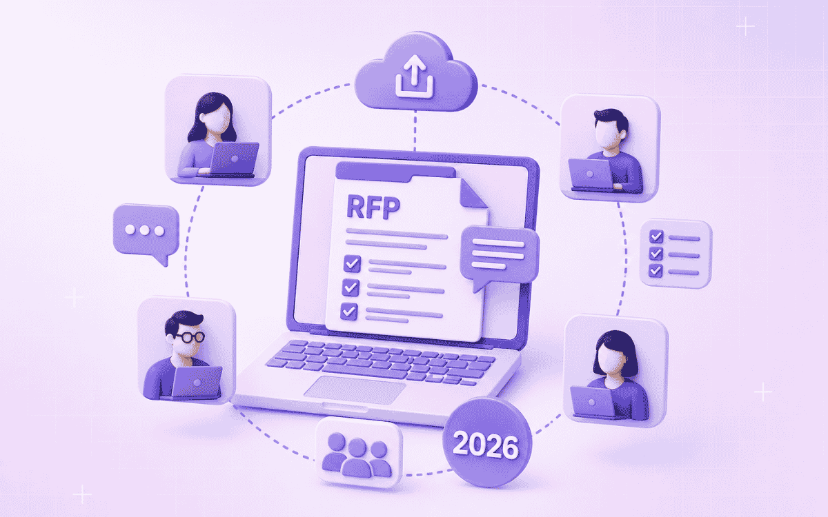
Vendor comparisons don’t just happen in spreadsheets. At some point, every RFP process reaches a critical stage:
Presenting vendor evaluations to stakeholders.
And this is where many teams lose momentum. Because even if your evaluation is strong,
Poor presentation can weaken decision clarity, delay approvals, or shift outcomes.
That’s why high-performing teams don’t just build comparison matrices. They use vendor comparison PowerPoint templates to communicate decisions clearly, visually, and persuasively.
What is a vendor comparison PowerPoint template?
A vendor comparison PowerPoint template is a structured slide deck used to:
- Present vendor evaluations side by side
- Summarize scoring frameworks and criteria
- Highlight strengths, risks, and trade-offs
- Guide stakeholders toward a final decision
It translates raw evaluation data into a clear, decision-ready narrative.
Typically, it includes:
- Evaluation criteria overview
- Scoring summary slides
- Vendor-by-vendor breakdowns
- Strengths vs weaknesses comparison
- Final recommendation
Why presentation matters in vendor selection
Even when evaluations are data-driven, decisions are made in meetings, not spreadsheets.
Stakeholders rely on presentations to:
- Quickly understand the differences between vendors
- Identify risks and trade-offs
- Align across teams (technical, finance, leadership)
- Justify decisions internally
If your presentation is unclear:
- Strong vendors may appear weak
- Risks may be overlooked
- Decisions get delayed or questioned
Clarity in presentation directly impacts selection outcomes.
What a strong vendor comparison presentation looks like
High-impact presentations are not just slides; they are decision frameworks in visual form.
They typically follow this structure:
1. Evaluation framework overview
Start by establishing how vendors were evaluated.
Include:
- Evaluation criteria (technical fit, pricing, compliance, etc.)
- Weightage assigned to each category
- Scoring methodology
This builds trust and ensures transparency.
2. Vendor score summary
Present a side-by-side comparison of all vendors.
Include:
- Weighted scores
- Ranking
- Key highlights
This slide answers: “Who is leading and why?”
3. Vendor deep-dive slides
Dedicate 1–2 slides per vendor:
- Strengths
- Weaknesses
- Risks
- Differentiators
Helps stakeholders understand each option beyond numbers.
4. Comparative insights slide
This is where real decision-making happens.
Show:
- Trade-offs between vendors
- Key differentiators
- Areas where one vendor clearly outperforms others
Make comparison easy, don’t make stakeholders think.
5. Recommendation slide
End with:
- Recommended vendor
- Justification aligned with evaluation criteria
- Key reasons for selection
This slide should feel like a natural conclusion, not a surprise.
Where vendor comparison presentations fail
Even well-structured evaluations can fail at the presentation stage. Here’s where teams lose impact:
1. Overloading slides with data
Dumping Excel tables into slides:
- Reduces clarity
- Overwhelms stakeholders
- Slows decision-making
Slides should simplify, not replicate spreadsheets.
2. Lack of a clear narrative
Presentations often show data but don’t answer: “What does this mean for the decision?”
Without a narrative:
- Stakeholders interpret differently
- Alignment breaks
3. Inconsistent messaging
Different slides say different things:
- Scores don’t match insights
- Risks aren’t aligned with recommendations
This reduces credibility instantly.
4. Weak differentiation
If all vendors look similar:
- The decision becomes harder
- Stakeholders default to safer or cheaper options
You must highlight clear differences.
5. No clear recommendation
Ending without a strong recommendation:
- Delays decisions
- Creates confusion
- Extends the sales cycle
What high-performing teams do differently
Teams that drive faster, better decisions:
- Translate evaluation data into clear visual insights
- Align every slide with the decision criteria
- Highlight trade-offs explicitly
- Maintain consistency across all slides
- Guide stakeholders toward a confident decision
This results in:
- Faster approvals
- Stronger alignment
- More confident vendor selection
Download the vendor comparison PowerPoint template
Instead of building presentations from scratch, use a structured template designed for decision-making.
This template includes:
- Evaluation framework slides
- Vendor comparison layouts
- Scoring summary visuals
- Recommendation slides
- Clean, executive-ready design
Use it to present vendor comparisons clearly and drive faster decisions.
Why most vendor comparison presentations don’t influence decisions
Most vendor comparison presentations fail not because the evaluation is weak, but because the insights don’t translate clearly on slides.
Here’s where things break down:
1. Data doesn’t translate into insight: Teams copy evaluation outputs into slides but don’t interpret them. Stakeholders see numbers, but not meaning.
2. Slides show “what,” not “so what”: A score of 85 vs 82 is shown.
But no one explains:
- Why does this difference matter?
- What risk or advantage does it create?
3. Stakeholders struggle to compare mentally: If slides don’t simplify comparisons:
- Each stakeholder forms their own interpretation
- Discussions become subjective
- Decisions slow down
4. The narrative is missing: Slides often jump between the following:
- Criteria
- Scores
- Vendor details
But it lacks a clear narrative that ties everything together.
The result:
- More questions than clarity
- Longer decision cycles
- Lower confidence in recommendations.
The real goal: From slides to decision clarity
High-performing teams approach presentations differently. They don’t treat PowerPoint as a reporting tool. They treat it as a decision interface.
Instead of asking:
“How do we present this data?”
They ask:
“How do we make this decision obvious?”
This shift changes everything:
From data display →Insight communication
Not just showing scores, but:
- Explaining what drives them
- Highlighting what matters most
From vendor description → Vendor positioning
Not just describing vendors, but also:
- Positioning them relative to each other
- Making strengths and gaps immediately visible
From neutral slides → Guided decision flow
Not just presenting options, but:
- Leading stakeholders toward a conclusion
- Reducing ambiguity at every step
From static slides → Strategic narrative
Not just sections, but:
- A clear beginning (criteria)
- Middle (comparison)
- End (recommendation)
The outcome:
- Faster alignment
- Fewer clarification loops
- More confident decisions
Why does this work better
- Feels tailored to the PowerPoint context, not reused RFP logic
- Speaks to stakeholder psychology, not just process
- Moves from the tool limitation → decision clarity problem
- Aligns perfectly with your conversion narrative
How SiftHub helps create presentation-ready vendor comparisons
The quality of your vendor comparison presentation depends entirely on the quality of the evaluation data feeding it. When vendor responses are inconsistent, incomplete, or scattered across emails and documents, your comparison slides reflect that chaos.
SiftHub solves this at the source, before data ever reaches PowerPoint.
Standardize vendor responses for clean comparisons:
When evaluating multiple vendors, you need apples-to-apples data. But vendors submit responses in different formats, with varying levels of detail, using inconsistent terminology.
AI RFP Software ensures your own RFP responses, when you're the vendor, are consistently structured, complete, and aligned with evaluation criteria. This means:
- All required sections addressed (no gaps that hurt your scoring)
- Consistent formatting across technical, pricing, and implementation sections
- Source-cited responses that build evaluator confidence
- Complete answers that give evaluators the data they need to score you accurately
Result: When buyers build their comparison slides, your responses translate cleanly into their evaluation matrices, no ambiguity, no missing data, no weak positioning.
Build winning collateral that strengthens your position
Beyond RFP responses, buyers often request executive summaries, capability overviews, or comparison one-pagers that feed directly into their internal presentations.
Sales collateral builder creates buyer-ready materials that:
- Highlight your differentiation with specific proof points buyers can copy into slides
- Maintain brand consistency so your materials look professional in any comparison
- Adapt by buyer context (industry, company size, use case) for relevant positioning
- Include verifiable metrics that give evaluators concrete data for scoring
Result: When buyers present vendor comparisons to stakeholders, your materials provide clear, compelling data points that make your strengths obvious—not something evaluators have to dig for or interpret.
Surface Your Strongest Proof Points Automatically
Buyers creating vendor comparison slides look for concrete differentiators: specific capabilities, measurable outcomes, and relevant experience. If these aren't obvious in your materials, evaluators may miss them, or score competitors higher who made their advantages clearer.
Personalization and AI teammate capabilities:
- Pull relevant case studies matching the buyer's industry and use case
- Highlight specific differentiators aligned with their evaluation criteria
- Quantify outcomes with metrics buyers can include in comparison slides
- Adapt messaging to the buyer's terminology and priorities
Result: When evaluators build "Strengths vs. Weaknesses" slides, your key advantages are documented, quantified, and easy to extract from your materials.
Conclusion
Vendor comparison PowerPoint templates are more than presentation tools.
They are:
- Decision enablers
- Alignment tools
- Communication frameworks
Teams that use them effectively don’t just present data.
They:
- Clarify choices
- Highlight trade-offs
- Drive confident decisions
And that’s what ultimately determines outcomes in competitive vendor evaluations.


%20breakdown.png)
