


.avif)

- Ronak from SiftHub’s frontend team explains how he thinks about the product’s interface: saving people time depends on every step of the interaction, not just a correct final output.
- Status says done before the work is usable: completion shows only after results land in the document, so users know exactly when to start reviewing.
- Progress bars reset and look like the job restarted: an indeterminate indicator replaced fake timers, and closing or reopening a panel no longer affects the job.
- “No results” flashes before data loads: loading, empty, and failed states are kept separate, so an empty message appears only when there really is nothing to show.
- Interrupted or failed tasks force users to start over: recovery targets only what failed, by regenerating the same response or retrying just the cells that didn’t get written.
- Ronak from SiftHub’s frontend team explains how he thinks about the product’s interface: saving people time depends on every step of the interaction, not just a correct final output.
- Status says done before the work is usable: completion shows only after results land in the document, so users know exactly when to start reviewing.
- Progress bars reset and look like the job restarted: an indeterminate indicator replaced fake timers, and closing or reopening a panel no longer affects the job.
- “No results” flashes before data loads: loading, empty, and failed states are kept separate, so an empty message appears only when there really is nothing to show.
- Interrupted or failed tasks force users to start over: recovery targets only what failed, by regenerating the same response or retrying just the cells that didn’t get written.
The answers were already in the spreadsheet. The activity beside them still said “In progress.”
That moment in our Microsoft add-in highlights two parts of the same flow: the result becoming available and the activity status updating. Someone looking at the screen needs to know whether to start reviewing or keep waiting.
I work on SiftHub's frontend, and these are the moments I want to pay closer attention to.
When I think about that moment, I picture the next few seconds: someone inspecting the filled cells, checking the activity, and deciding what to do next. The interface needs to make that decision clear.
I'm writing about these transitions because giving people time back depends on the whole interaction. Time spent checking whether a task finished, or reconstructing a request after an interruption, belongs in that cost too. It is easy to miss that cost when the final output looks correct.
The design work is in the transitions: when a request becomes a usable result, when a loading state becomes an empty state, or when an interrupted operation becomes recoverable.
A spinner, percentage, or success message represents a claim about that state. The condition behind it needs to be as precise as the message on screen.
1. Put completion after the last step needed to use the result
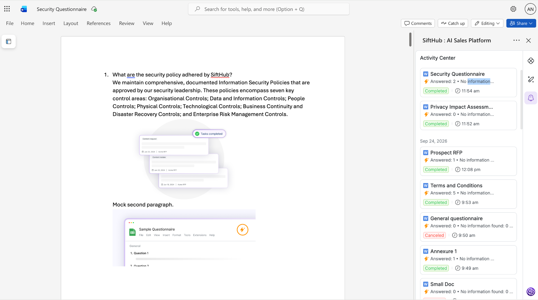
Autofilling a document involves several stages. Answers are generated, the generated document is retrieved, and its contents are applied to the open file. Each stage can finish at a different time.
The visible workflow follows this sequence:
Generation → retrieval → document insertion → ready for review
A generation-complete event establishes that the generated result is available. The document can still be waiting for its contents to change. Ending the loading state at that first event would make the interface announce completion too early.
In our Word project flow, the add-in keeps autofill in progress while it retrieves and inserts the generated document. It waits for the document update to finish before setting the state used by the “Autofill completed.” banner. Retrieval and insertion share the same visible in-progress state; they do not need separate labels to preserve that ordering.
The Excel example at the start illustrates another timing boundary: answers were visible while the activity still read “In progress.” Both cases point to the same requirement. The document and the status need to agree about whether the result is ready to review.
The completion condition has a specific scope: the generated content has reached the document. It does not establish that the answers have been reviewed or that the file has been saved to disk or the cloud.
A useful verification is to delay insertion after generation finishes. During that interval, the UI should still indicate that autofill is underway. After insertion succeeds, the document and its completion status should converge without requiring a refresh.
2. Keep progress separate from elapsed time and panel visibility
A progress percentage needs a measurable basis. “60% uploaded” can describe bytes transferred out of a known total. Time spent watching an animation does not establish how much of a generation task has finished.
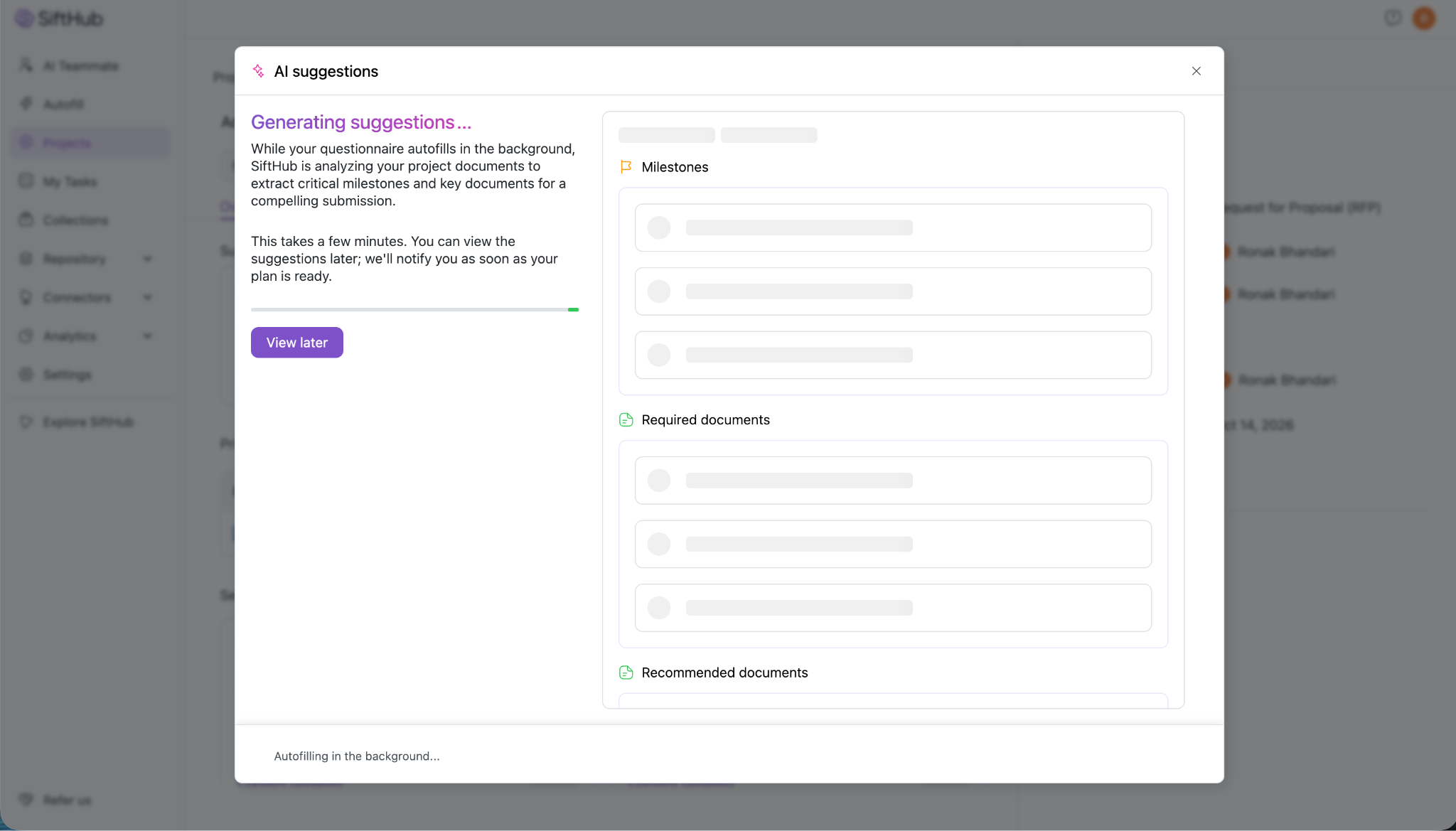
An earlier version of AI Suggestions used a client-side timer to simulate progress. It advanced toward a high percentage, then slowed down while waiting for completion. Refreshing or reopening the view could reset the displayed progress, making it appear that the operation had restarted.
The observed behavior was a reset of the displayed progress. That behavior did not establish that the underlying job had restarted. The interface had tied the apparent progress of a longer-running operation to the lifetime of the component showing it.
We removed the simulated percentage and replaced it with an indeterminate indicator: a moving strip with no numeric value. Completion comes from the project's suggestions status. A completion update triggers a project refresh, and the completed view renders from that data.
There are three separate concerns here:
- Operation state: whether suggestions are still being generated or are complete.
- View state: whether the suggestions panel is open.
- Animation state: how the working indicator is drawn.
“View later” changes the panel's visibility. Its handler closes the modal without cancelling or restarting generation. Reopening the panel should reflect the operation's current state, regardless of whether its animation starts a new cycle.
An indeterminate indicator has limits too. A moving strip does not prove that a remote process is healthy or predict how long it has left. Its meaning is narrower: the UI has not received a completed result. The surrounding text names the task, explains what is being analyzed, and makes the option to leave the panel explicit.
The relevant checks are therefore about lifecycle: close and reopen the panel, refresh during generation, and return after completion. Those actions should not turn a display reset into an apparent reset of the work.
3. Distinguish an unresolved list from an empty result
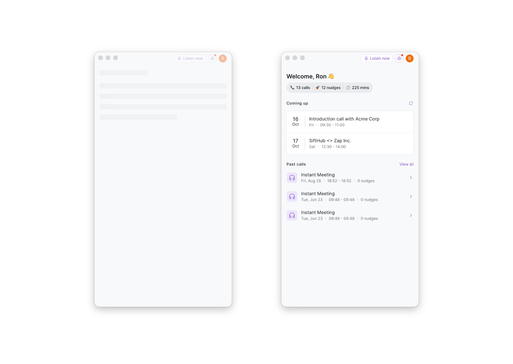
An empty array is often the initial value for a list. It is also a valid result from a successful request. Checking only `items.length === 0` cannot distinguish those conditions.
On the desktop home screen, that distinction surfaced as “no calls” appearing before the call lists arrived. The final data could be correct while the initial screen briefly communicated the wrong result.
The request outcome needs to participate in the rendering decision:
The current Home flow uses an initial loading gate. It displays a skeleton while the initial requests are unresolved. Once they settle, each list checks its error state before deciding between an empty message and populated content. An error that happens to leave an empty array therefore does not become “no calls.”
Refreshing an already loaded screen is a separate case. During a manual refresh, the existing content stays visible, and the refresh icon indicates activity. Repeated refresh clicks are ignored while the request is pending. This preserves context while the interface checks for newer data.
Retaining content during the request does not mean keeping it through every failure. In the full refresh path, a failed list is replaced by its error state. That is another transition to account for explicitly.
Skeleton timing is a separate design decision. The current initial loading branch shows its skeleton immediately. A fast response can therefore produce a brief loading flash. Delaying the skeleton is an option to evaluate, but the actual rendering branch must honor that delay. Keeping placeholder space reserved can reduce movement when a skeleton appears; it does not guarantee that the final content will have the same height.
Initial loading, successful empty results, failures, and refreshes with existing data all need distinct checks. They may share a component, but they do not carry the same meaning.
4. Make recovery a state with its own actions
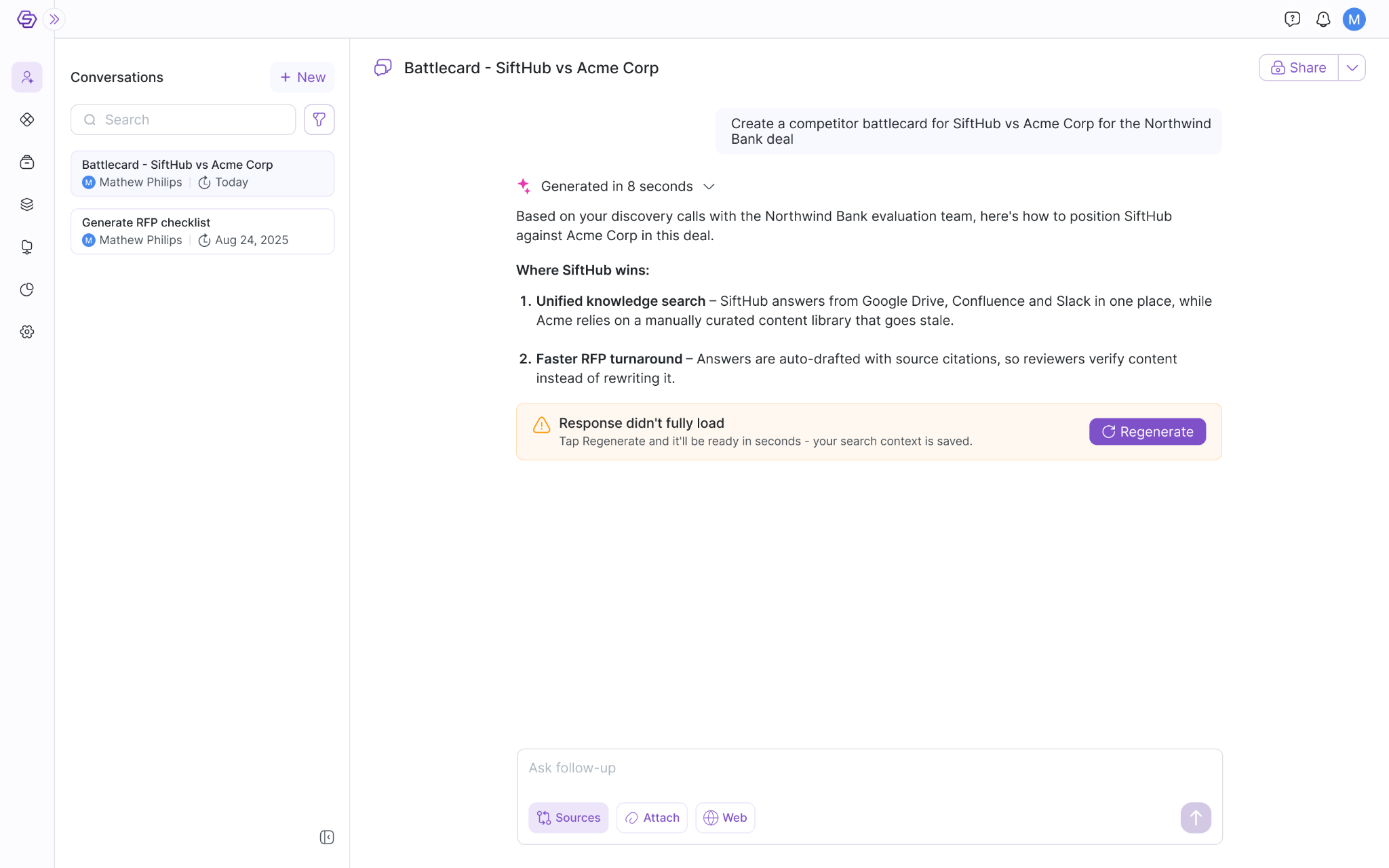
Streaming output introduces a state between “nothing has arrived” and “the answer is complete.” Some text may already be visible when the stream stops.
We had reports of interrupted responses leaving partial output and a frozen cursor. After a refresh, the response could be missing. The visible text alone was not sufficient evidence that the answer had completed or could be recovered.
The recovery flow uses an explicit eligibility signal. When the latest response is marked `canRegenerate`, the interface shows “Response didn't fully load” with a Regenerate action. This is a conditional state supplied by the response data; it is not inferred merely from an animation stopping.
Regenerate reuses the existing response identifiers and re-enters the loading flow for that conversation turn. The frontend clears the transient streaming buffer while retaining the surrounding thread data. It does not construct a new question from whatever text happened to remain on screen.
That distinction defines what needs to survive an interruption: the identity of the request and the context needed to retrieve its response. The UI copy says the search context is saved. The directly observable frontend behavior is that the retry stays attached to the existing response.
Recovery also changes which actions are available. While the latest response is marked recoverable, the normal answer display is replaced by the recovery message, and actions such as Copy and Create a doc are withheld. Those controls would otherwise suggest that a completed answer was available to use.
The retry still needs loading and failure handling of its own. Reusing response identity does not imply exact continuation from the last visible token or guarantee that another attempt will succeed.
The wording around recovery deserves the same care: the current message says the answer will be “ready in seconds.” That introduces a timing claim alongside a recovery action. The interface can be definite about what Regenerate does while being more careful about predicting how long the response will take.
5. Match retry and skip actions to the failed unit of work
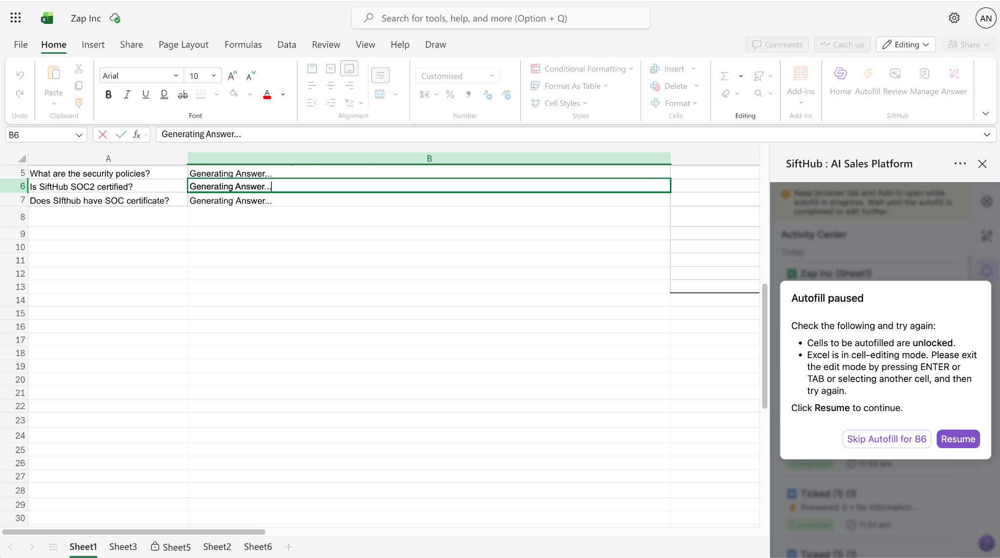
In a spreadsheet, an answer can finish generating and still fail to reach its destination cell. Generation and insertion have different failure conditions, so recovery needs to identify which stage failed.
The Excel add-in retains a pending insertion record when a cell write fails. The recovery screen shows “Autofill paused,” asks the user to check that the target cells are unlocked, includes available error detail, and offers Resume or “Skip Autofill for [cell].”
The actions operate on the pending insertions:
- Resume attempts the pending records again. A record is removed after its insertion succeeds. The flow then checks whether any records remain before clearing the recovery state.
- Skip Autofill for [cell] removes the pending record associated with the reported error, then attempts the remaining records. It targets the named cell, regardless of which cell is currently selected in the worksheet.
Neither action needs to regenerate the whole questionnaire. The unfinished work is the insertion, and the recovery path preserves that scope.
“Paused” is the label of this recovery screen. It does not mean every generation task or every background update has stopped. Naming the affected cell makes the available choice more precise than the overall status label alone.
Each action has its own pending feedback. The button keeps its label visible, shows a spinner, and disables itself while its action runs. Without that acknowledgement, clicking Resume could produce another uncertain wait inside the recovery flow.
The important transitions are a successful retry, a retry that still leaves pending work, and skipping the reported cell while continuing with the remaining records. The screen should clear because its recovery condition has been resolved, rather than simply because a button was clicked.
Keep the status and the result in agreement
I come back to that spreadsheet: answers in the cells, an activity still marked “In progress,” and a person deciding whether to begin reviewing. The useful question is what would make that next step clear. The result and the status need to describe the same stage of the task.
The same relationship matters throughout an asynchronous interface. Completion needs to follow the usable result. An empty message needs a successful empty response. Recovery needs enough retained state to retry the unfinished work. Controls need to reflect what is valid in the current state.
When I review these flows, I look at the boundaries between states: generation finished but insertion pending, a panel reopened during an active job, a refresh with existing data, or a retry that fails again. Those are the points where individually reasonable components can give a contradictory account of the same task.
For me, giving people time back starts with that agreement between status and result. In the spreadsheet, the next action should have been clear: the answers were ready to review. A status is useful when it makes clear whether to wait, act, or start using the result.